
Helping teachers help students:
WeVideo for Classrooms
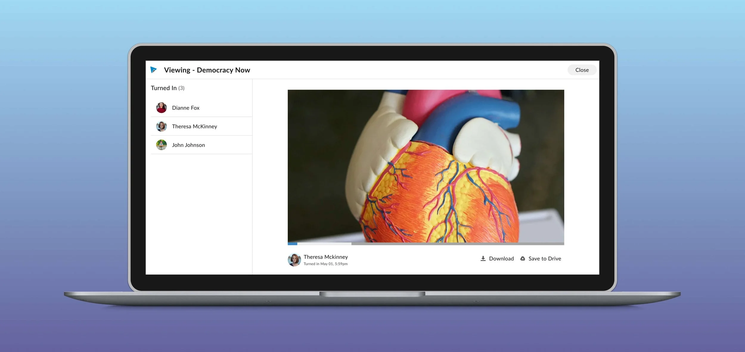
Industry: SaaS, EdTech, B2B, Enterprise Platform: Responsive Web
Highlights
I led a redesign of WeVideo’s flagship product to focus on engagement and scalability for K-12 Education, creating a new design system and improving UX across the board.
Key leader shaping project direction & company future
Developed the company’s 1st next-generation product app
Strategic planning, decision-making, task-management
Established the company’s 1st design system centering WCAG accessibility standards
Impact
Increased NPS score by +33 points with positive feedback from users
Recognition
Awarded “WeVideo hero” for significant contributions to the project
Summary of Contributions
🔭 Initial Discovery
Audited the existing product, analyzed internal user feedback data, and led project kick-off discussions with the PM, Head of Engineering, and Design Leadership to align on vision and scope.
♟️ Product Strategy
Created and presented the vision deck to Leadership, socialized the initiative across departments, and identified strategic opportunities. Defined the design roadmap, aligning deliverables with business goals and stakeholder expectations.
🔬 User Research
Led user and stakeholder interviews, collaborated with Sales for customer insights, and conducted competitive analysis and heuristic evaluations to drive informed design decisions.
📐 Product Design
Owned the end-to-end UX journey, from discovery to delivery. Strategically divided and delegated tasks to a junior designer to maximize efficiency and mentorship impact.
🚢 Design Systems
Led the creation of the company’s first design system, establishing scalable foundations for icons, typography, spacing, and component patterns, fostering consistency and speed across teams.
♿️ Accessibility
Ensured all components met WCAG accessibility standards. Introduced a new dev handoff process to guide engineering on key elements like contrast, tab order, and focus states.
Background
WeVideo is a cloud-based video editing platform used across education, B2C, SMBs, and enterprises. While users were able to create and share professional-quality videos online, the decade-old product had become increasingly difficult to scale. Years of technical and UX debt made it hard to deliver a seamless, modern experience resulting in an increasing frustration for our users.
Problems
Users were asking for features we couldn’t integrate. The outdated codebase prevented us from delivering modern features users expected, many of which were already standard offering from our competitors.
The interface was inconsistent and disjointed from a lack of unified design patterns, leading to user cognitive load and confusion.
The product failed accessibility standards, with issues like low contrast, small text, and poor keyboard navigation. It made it unusable for some students and prevented adoption in districts with legal accessibility requirements.
Opportunity
To support growth and user satisfaction, we shifted focus to our most engaged and profitable vertical, K-12 education. This meant reimagining the video assignment experience for teachers and students, with an emphasis on simplicity, clarity, and accessibility. The design challenge was to create a tool that felt intuitive for students of all ages, while making it easier for educators to manage and assess video-based learning.
Business Goals
Engage and Inspire: Design a classroom-friendly tool that teachers love using.
Build for the Future: Establish a scalable design system and architecture that supports long-term growth and seamless evolution across our products.
Design for All: Ensure every teacher and student can participate by meeting WCAG AA accessibility standards by improving usability for everyone, and not just those with specific needs.
Scope based on Priority
Defined requirements and prioritized the most impactful workstreams based on our primary users (teachers) and their most common use cases and needs.
Audited of the current state: what’s not working, what is working, what we know, and need to know.
Broke down large design tasks and delegated.
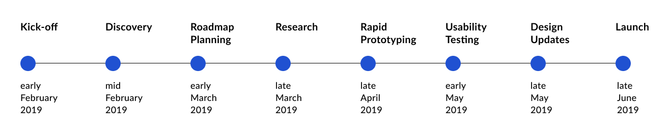
As the lead designer for the complex and ambiguous project with a limited time, I created a game plan for the designs and schedule based on the necessities for the MVP for our intended launch date.
Research
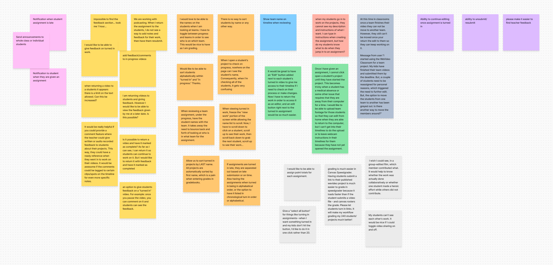
I conducted multi-methodology research efforts to understand the user's core goals better and needs with specific research questions that we needed to get answered. After organizing meaningful findings in a spreadsheet based on features, I consolidated the analysis with recommendations, UX values, and UX priority ratings.
Methods
Investigate current data repositories and synthesize
There was already some user data and research done so I didn’t need to spend more valuable time and resources, given our short deadline.
Interview our Education ambassadors and sales representatives
A quick way to understand the teachers’ unique pain points and wants to define use cases and user journeys as well as to know their biggest selling points and detractors in the education space.
Competitive analysis
I needed to see how our competitors solved similar issues in Edtech industry and compare their solutions.
Main takeaways
Teachers often had to use time-consuming workarounds with the flagship product
Unnecessary features confused students, especially in the younger grades.
Accessibility issues made the product hard to sell to districts and excluded users.
Multi-Persona User Flows
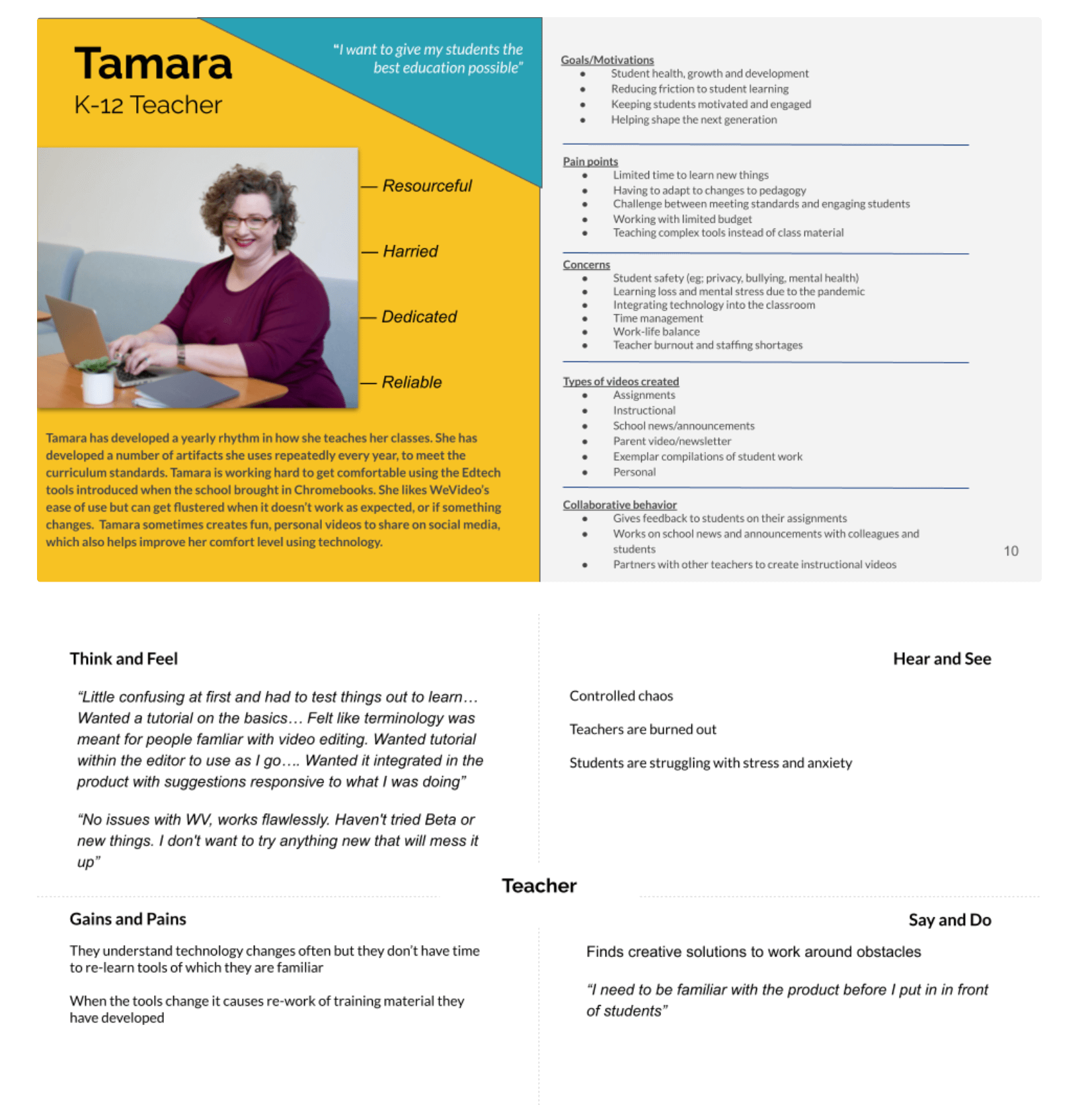
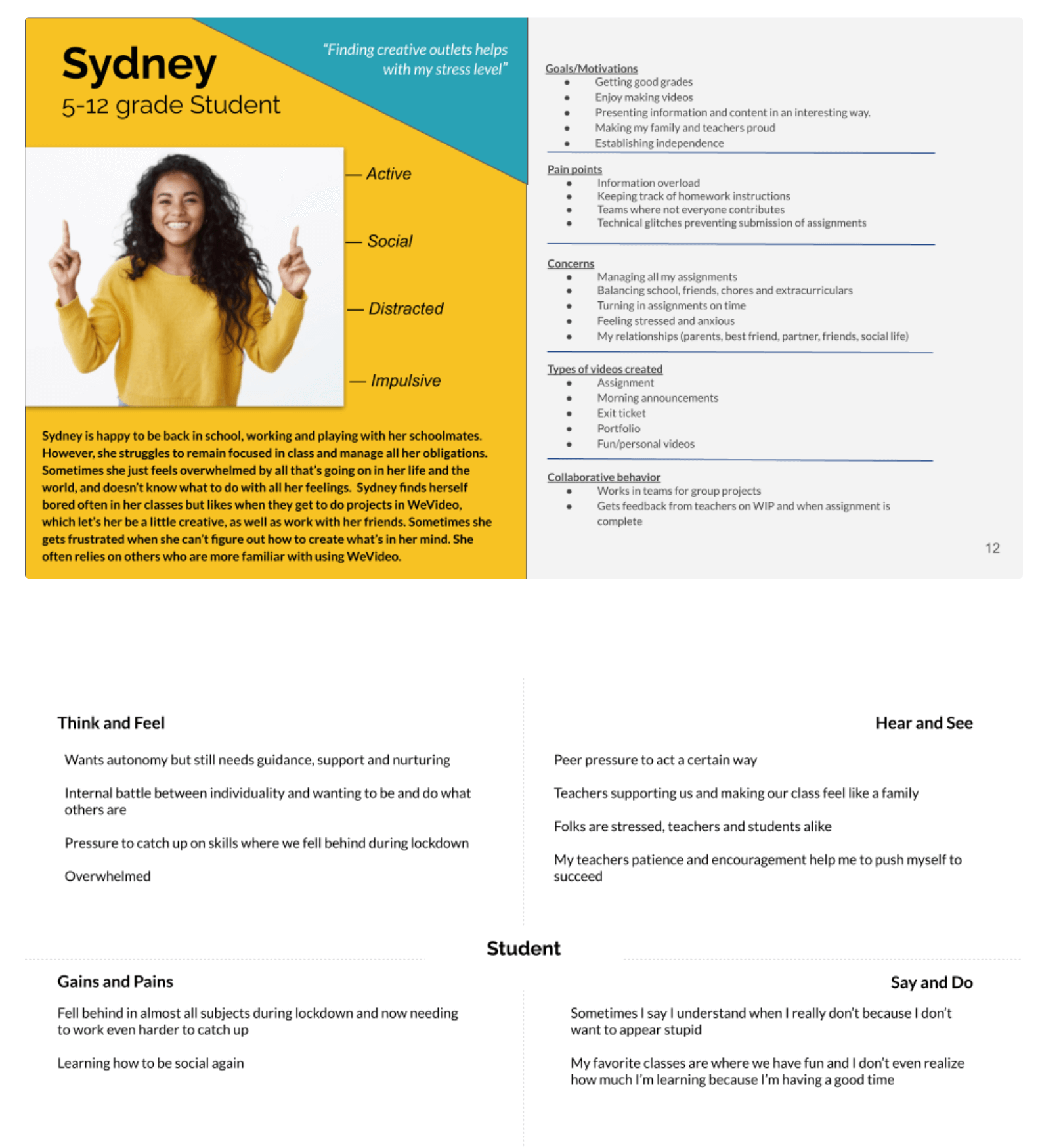
During a team meeting, a disagreement among different stakeholders helped me identify a critical misalignment in who our users were. To create shared alignment, I proactively:
Led a Proto-persona workshop with nine cross-functional stakeholders, delivering actionable primary and secondary personas with just 90 minutes of collaboration and two hours of synthesis.
Transformed these insights into strategic, user-centered journey flows, ensuring design decisions were rooted in empathy and aligned with business goals
Limitations - I knew that the personas would need more time and research to validate, but we were no longer blocked by misalignment. I had also identified 2 other personas but again with time constraints, I made a plan to return to the Persona research post-launch.
Brainstorm sessions
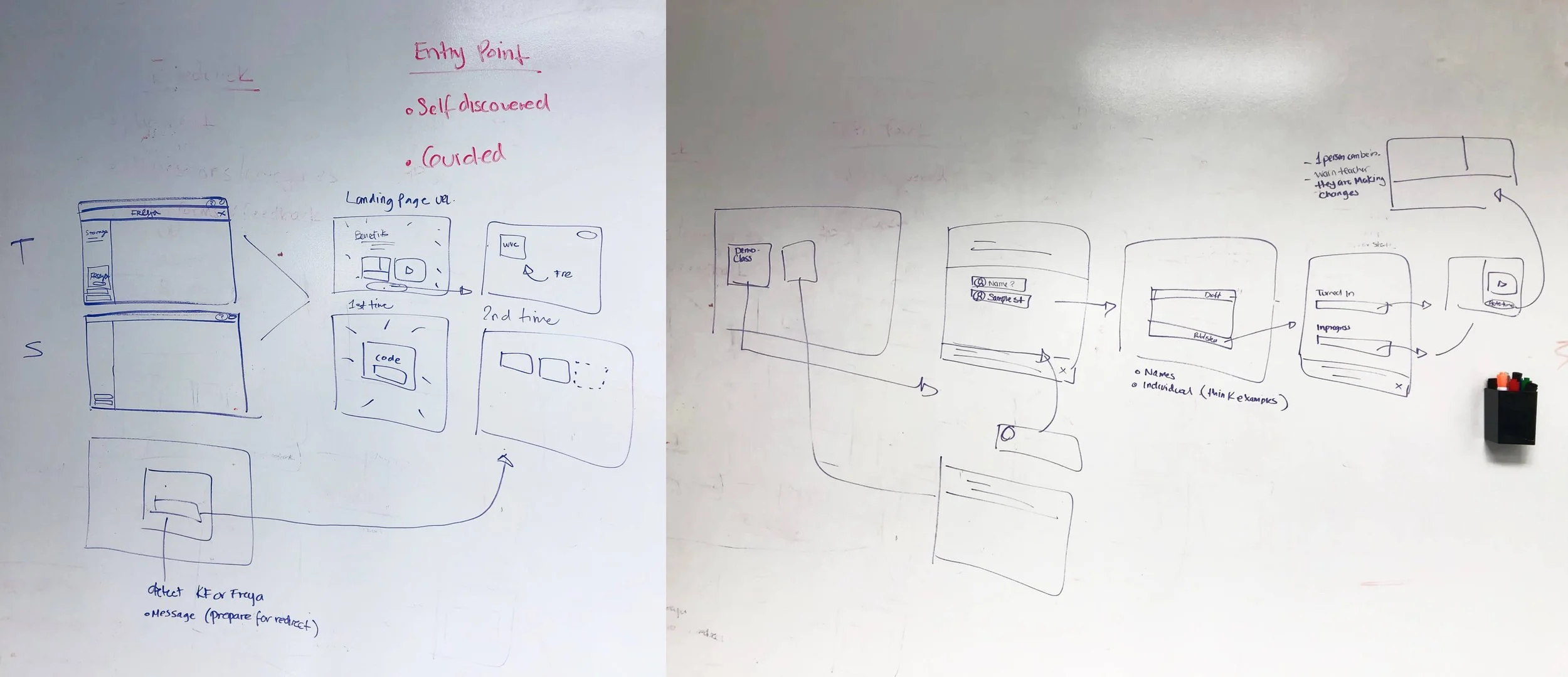
I rapidly mapped out user flows to visualize the end-to-end experience, then drove collaborative brainstorming and fast-paced iterations to ensure the concept was cohesive, scalable, and aligned across the system.
Design Systems for Speed, Consistency, and Accessibility
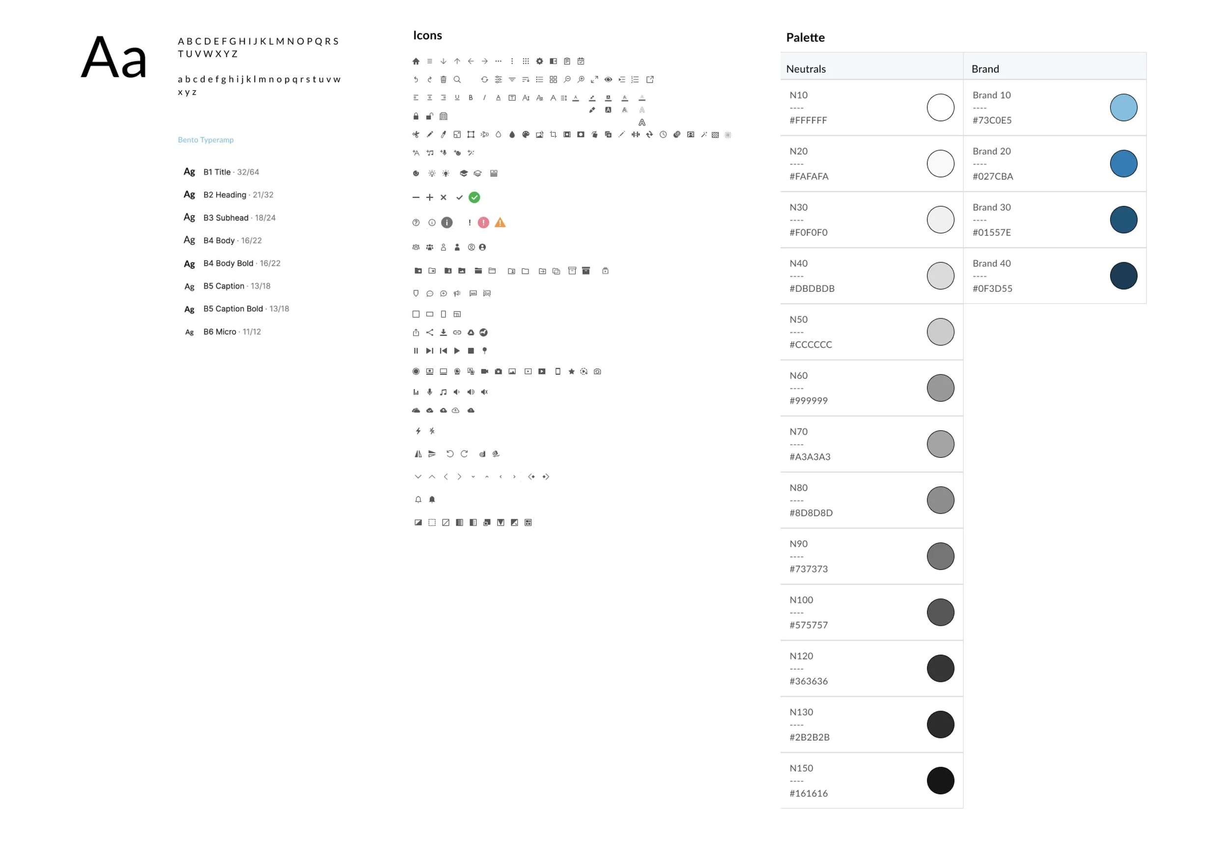
To streamline workflows and scale design efficiently:
I created WeVideo’s first scalable design system.
The system reflected WeVideo’s brand values while driving consistency across platforms.
Every component was built with accessibility in mind, meeting WCAG standards to support inclusive design and faster development handoff.
Usability Testing
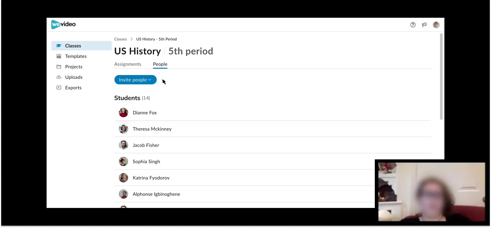
I identified key friction points early, rapidly prototyped a solution, and tested with our Education Ambassadors.
Main takeaways
Users skipped key steps we thought were intuitive, highlighting where clearer guidance or design cues were needed.
While users said the feature was useful, testing showed they struggled to find or use it. This highlighted the need for better discoverability.
A minor copy change and a repositioned button reduced task completion time by 40%, showing how small UX shifts can have a major impact.
After design updates with clearer next-step navigation, there was a 30% increase in task success rate
Final Design
Impact
Increased NPS score by +33
After just six months, WeVideo Classroom was launched and received enthusiastic feedback and strong engagement from the Education Ambassador community. The initiative was recognized by C-suite leadership as an “exemplary project” that set a new benchmark for future company-wide efforts.
A completely new codebase, enabling support for the latest technologies, performance enhancements, and future feature scalability.
I drove the creation of a fully accessible, brand-new design system, collaborating closely with Accessible360. Their audit confirmed the product met industry standards for inclusive design, establishing a new accessibility baseline at WeVideo.
Learnings & Problem-Solving
Faced with ambiguity and tight deadlines, we operated in a lean, fast-paced environment, prioritizing high-impact solutions to keep momentum without losing sight of long-term quality.
When time zone and communication challenges arose with our engineering team in Romania, I introduced video demo walkthroughs for developer handoffs and feasibility questions. This approach dramatically decreased friction and increased team alignment.
With a fixed timeline, we had to critically evaluate the scope of our selected user journeys. We made strategic compromises, choosing to launch a beta with select users to validate assumptions and minimize risk before the full launch.