
3rd case study
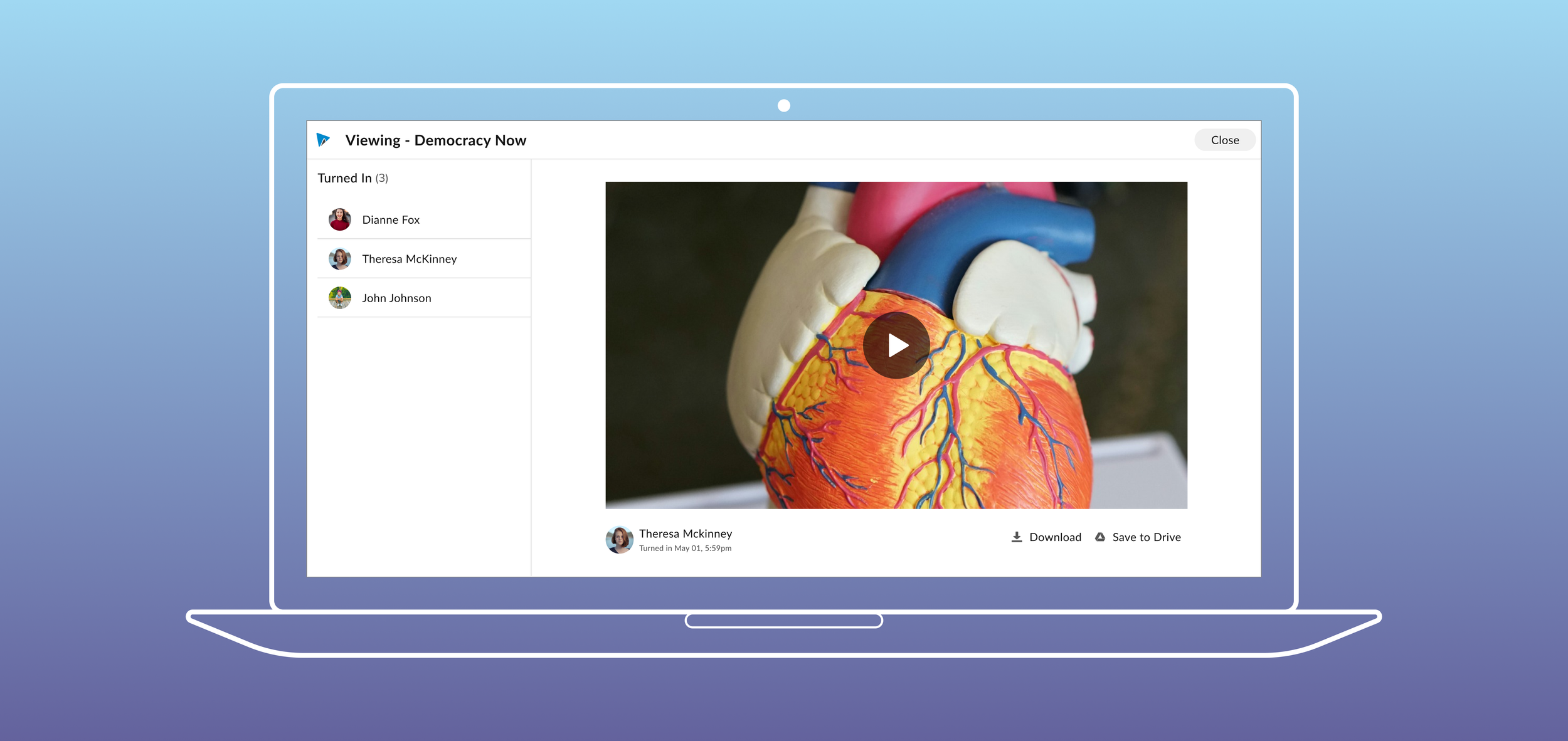
Industry: SaaS, EdTech Platform: Responsive Web
Highlights
Key leader shaping project direction & company future
Developed the company’s 1st next-generation product app
Strategic planning, decision-making, task-management
Established the company’s 1st design systemy you tell your story online can make all the difference.
🔭 Initial Discovery
I audited the current product, analyzed data from the repository of internal user feedback, and drove project kick-off discussions with the PM, Head of Engineering, and Design Management.
♟️ Product Strategy
I created the vision and pitch deck and socialized the initiative to Leadership. I also socialized, identified opportunities, and drove collaborations across various cross-departmental teams. I created the design roadmap of deliverables and expectations.
🔬 User Research
I ran interviews with users, stakeholders, and sales representatives, as well as competitive analysis, and heuristic evaluation.
Impact
Success launch with an NPS score of +33 with positive feedback from users
🏆 Recognition
Awarded as the “WeVideo hero” in March 2023 for significant contributions to the project
Summary of Contributions
📐 Product Design
I owned the UX and UI from Lo-, Mid-, to Hi-fi. I divided my tasks and delegated them to the junior designer.
🚢 Design Systems
I drove the creation of the 1st design system in the company: icons, typography, padding, patterns, etc.
♿️ Accessibility
I made sure the UI experiences followed WCAG best practices. I created a new Blue-lines hand-off process for accessible design including tab order, etc.
BACKGROUND
Understanding the problem
WeVideo is a web, cloud-based video editing platform supporting B2C, small-to-medium B2B and large enterprises to upload their content to create, view, and share professional-quality videos. However, the 10-year-old product had reached a point where scaling was no longer feasible.
Technical and UX Debt
The codebase was old and not scalable
No unified style or patterns - There was a mix and match of Google material icons and miscellaneous sources
The advanced features were confusing to students
Not AA compliant - Low contrast, small font size, incorrect keyboarding, and wayfinding/ tabbing, etc. (This is a huge deterrent for sales because in some districts, educational institutes have a legal obligation to be accessible.)
Opportunity
We decided to focus our resources on K-12 education (the most profitable sector) and create an easy-to-use video assignment experience for teachers and students with their unique challenges and wants.
Business Goals
Delight - Become an Edtech tool that teachers are happy to adopt
Sustainable - Create a scalable foundation for our future tech and design in the next offering of our next-generation products
Accessible - Become AA compliant
Simple/ easy-to-use
Target users
Primary - Teachers
Secondary - Students
KICK-OFF [Problem space]
Scope based on Priority
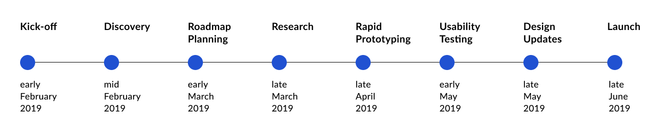
As the lead designer for the complex and ambiguous project with a limited time, I created a game plan for the designs and schedule based on the necessities for the MVP for our intended launch date.
I defined requirements and prioritized the most impactful workstreams based on our primary users (teachers) and their most common use cases and needs.
I ran an audit of the current state: what’s not working, what is working, what we know, and need to know.
I broke down large design tasks for the junior designer supporting the project.
RESEARCH [Problem space]
Gathering data
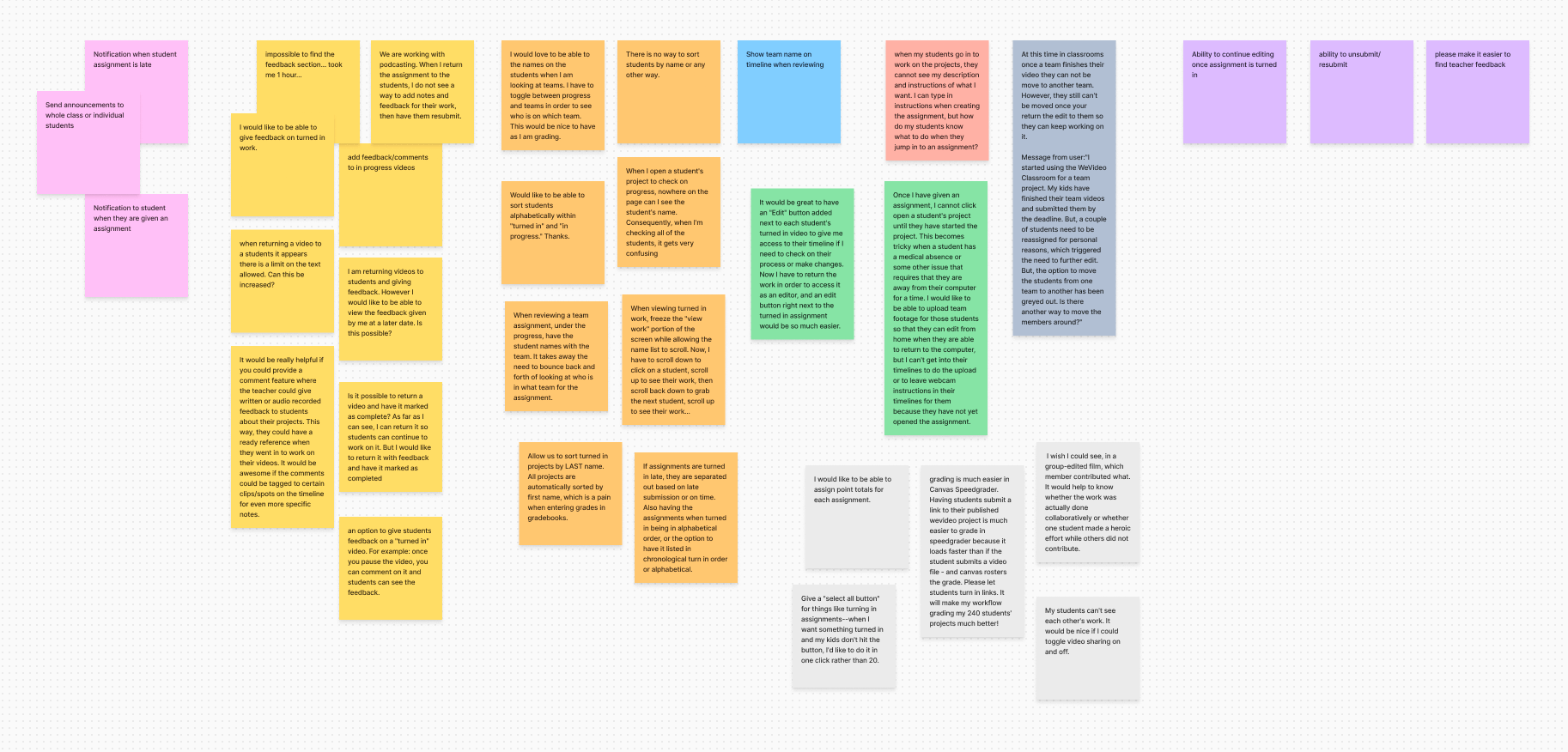
I conducted multi-methodology research efforts to understand the user's core goals better and needs with specific research questions that we needed to get answered. After organizing meaningful findings in a spreadsheet based on features, I consolidated the analysis with recommendations, UX values, and UX priority ratings.
Methods
Interviewing our Education ambassadors - to understand their unique pain points and wants to define use cases and user journeys
Speaking with our sales reps - to know their biggest selling points and detractors in the education space
Competitive analysis - to see how our competitors solved similar issues in Edtech industry
DEFINE [Problem-solving space]
Multi-Persona User Flows
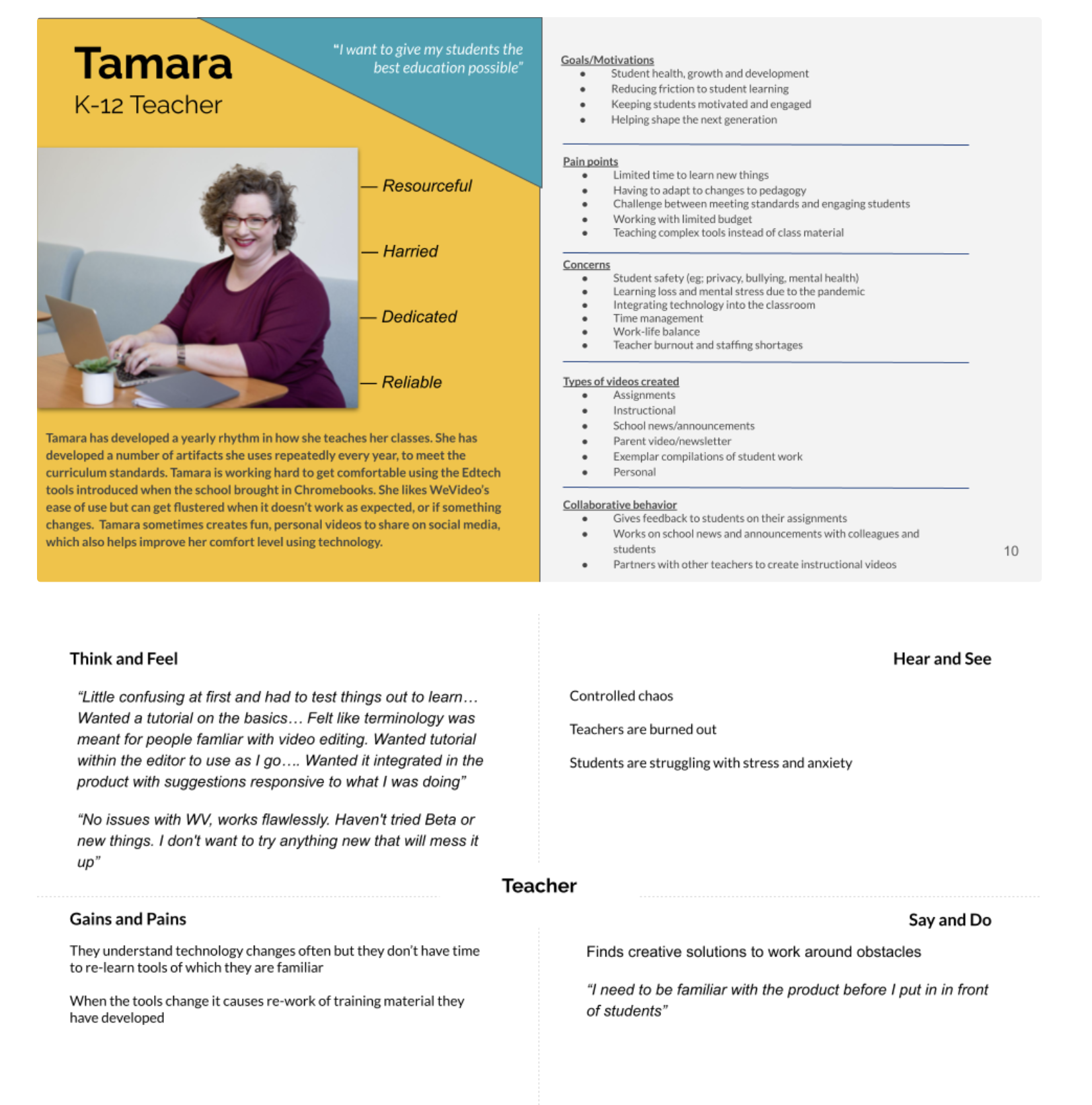
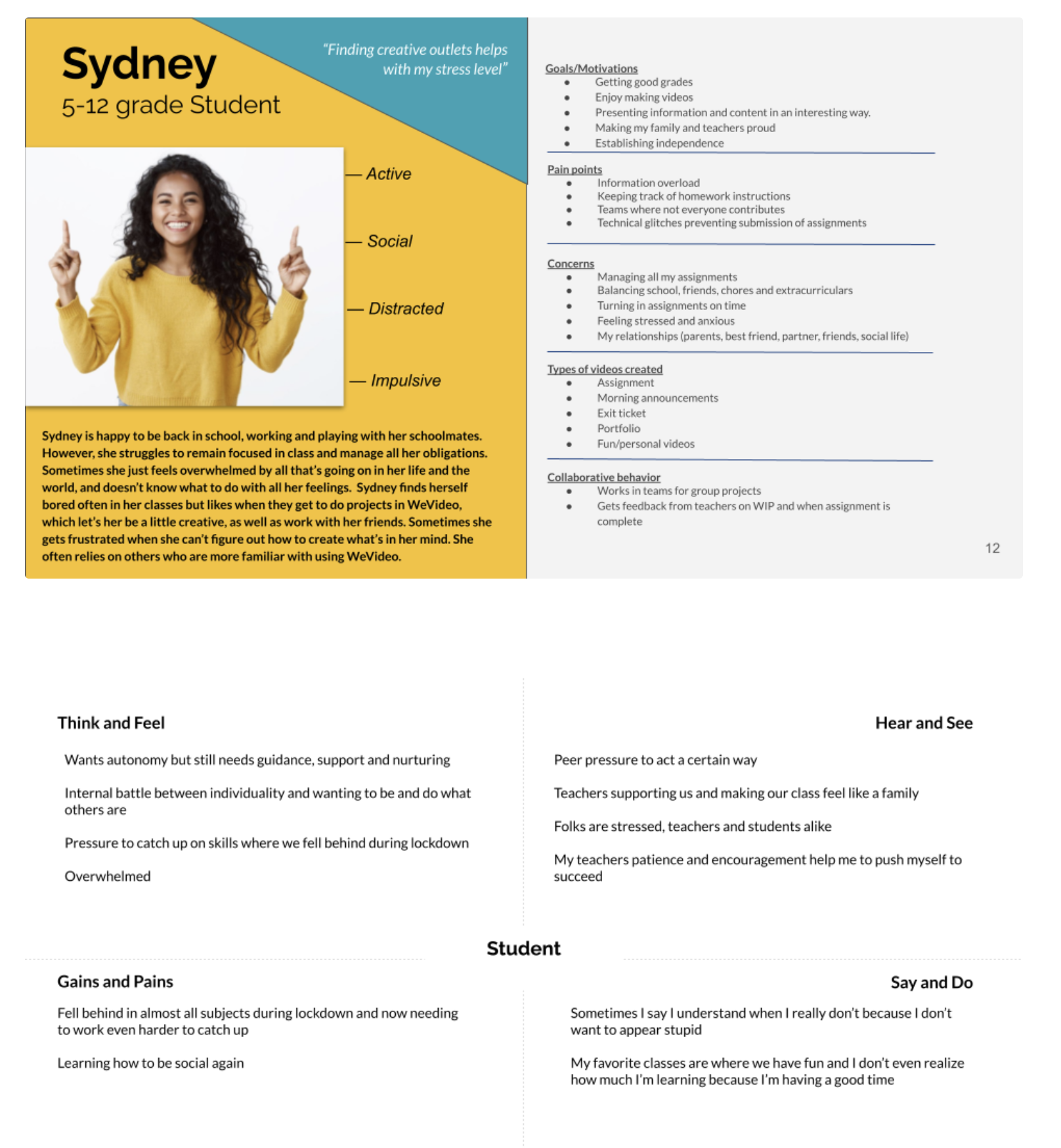
After refining core use cases from research, I realized the team needed to be in alignment on who was navigating the app versus operating on personal assumptions.
Proto-persona workshop
Due to limited time and resources, we settled on a lightweight method for defining our personas with a workshop. With 9 various cross-departmental stakeholders in 90 minutes (and an additional 2 hours of synthesizing and creating the deliverables), we identified our primary and secondary personas. Based on these insights, I was able to make empathically informed decisions in the user journey flows.
Limitations: We knew that the personas would need more time and research to validate, but we had enough to get started for this project. We had also identified a third persona but again with time constraints, we had to set that one aside for the moment.
DESIGN/ ITERATE
Lo-Fi
Brainstorm sessions
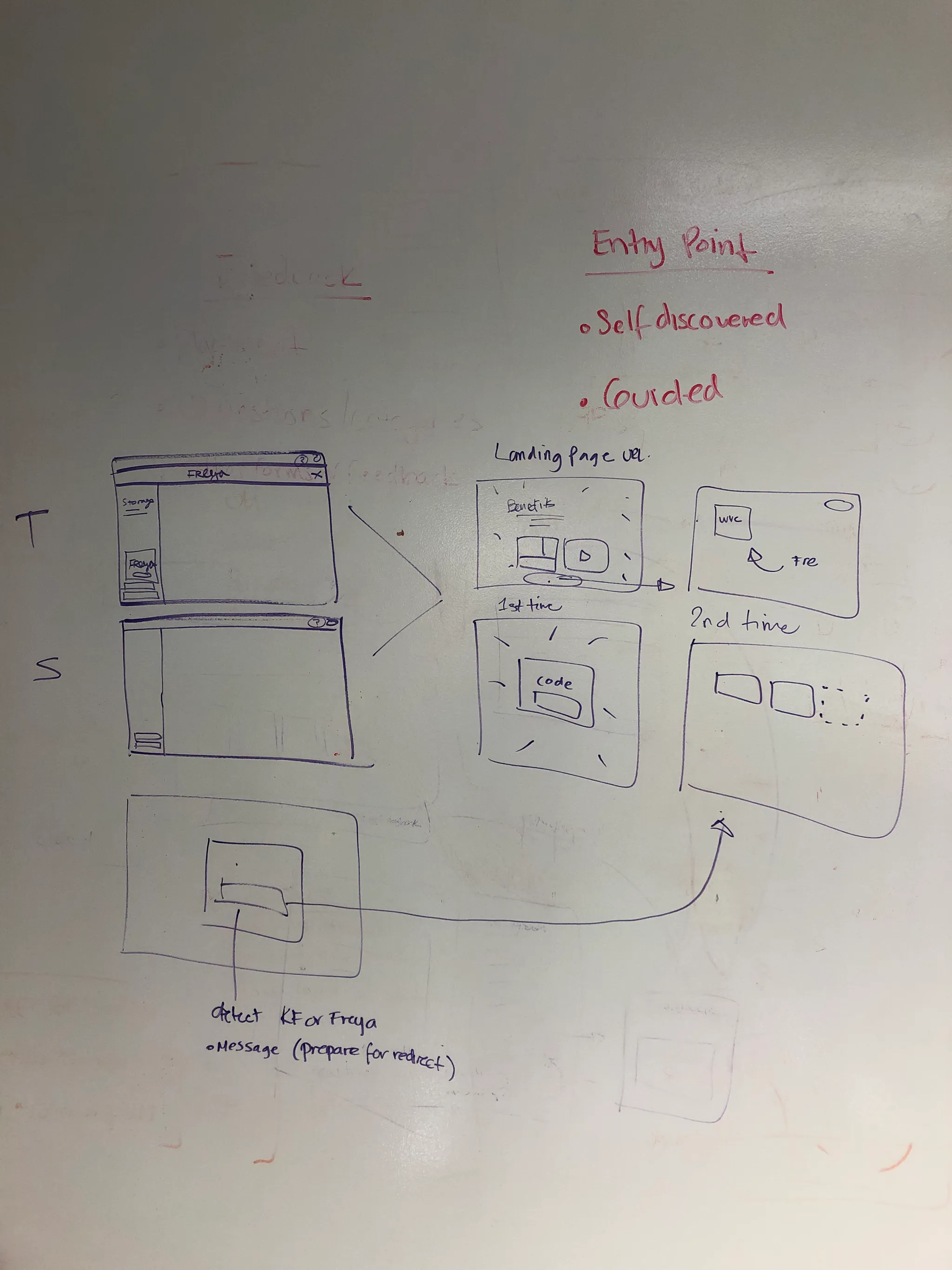
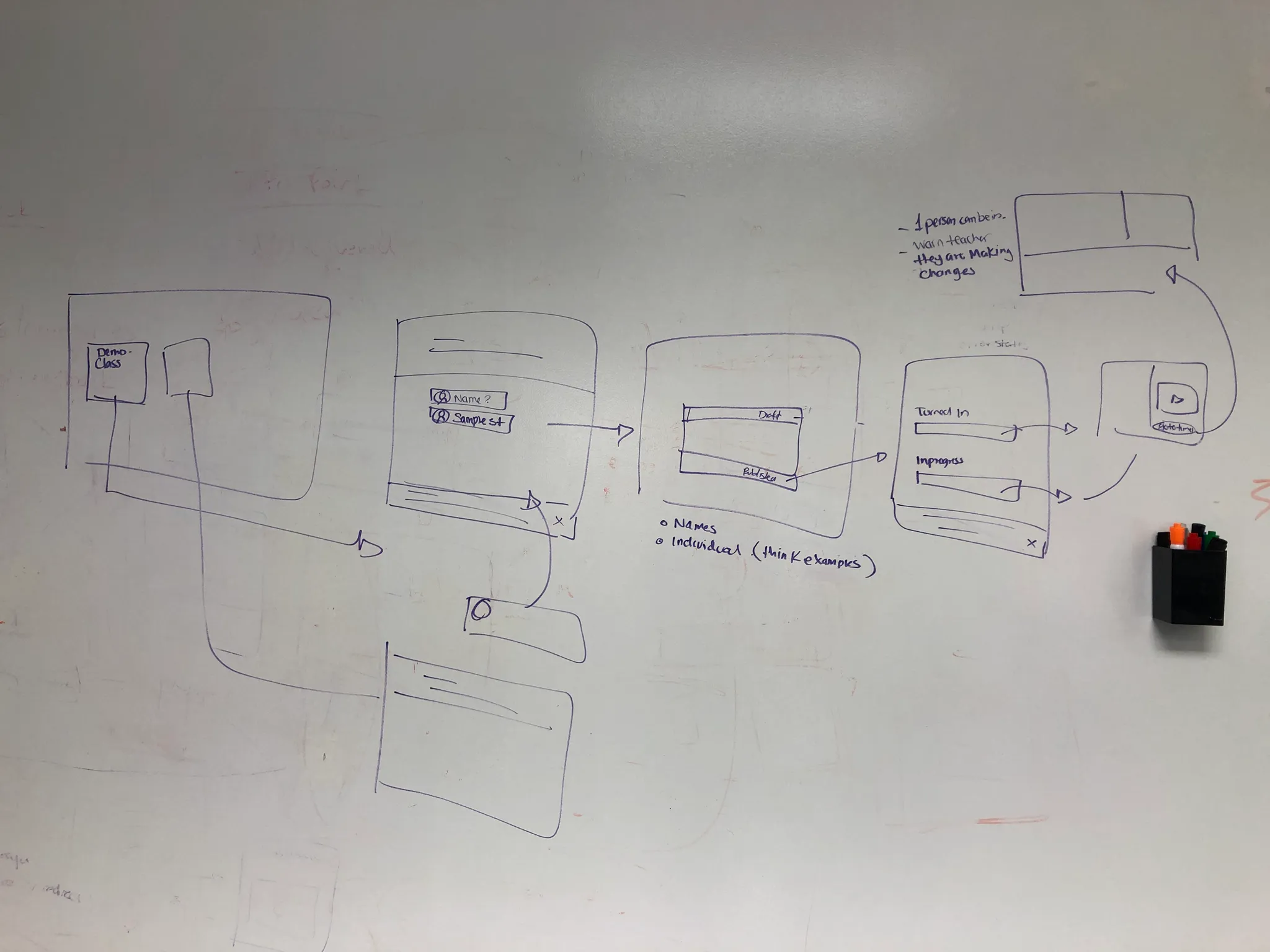
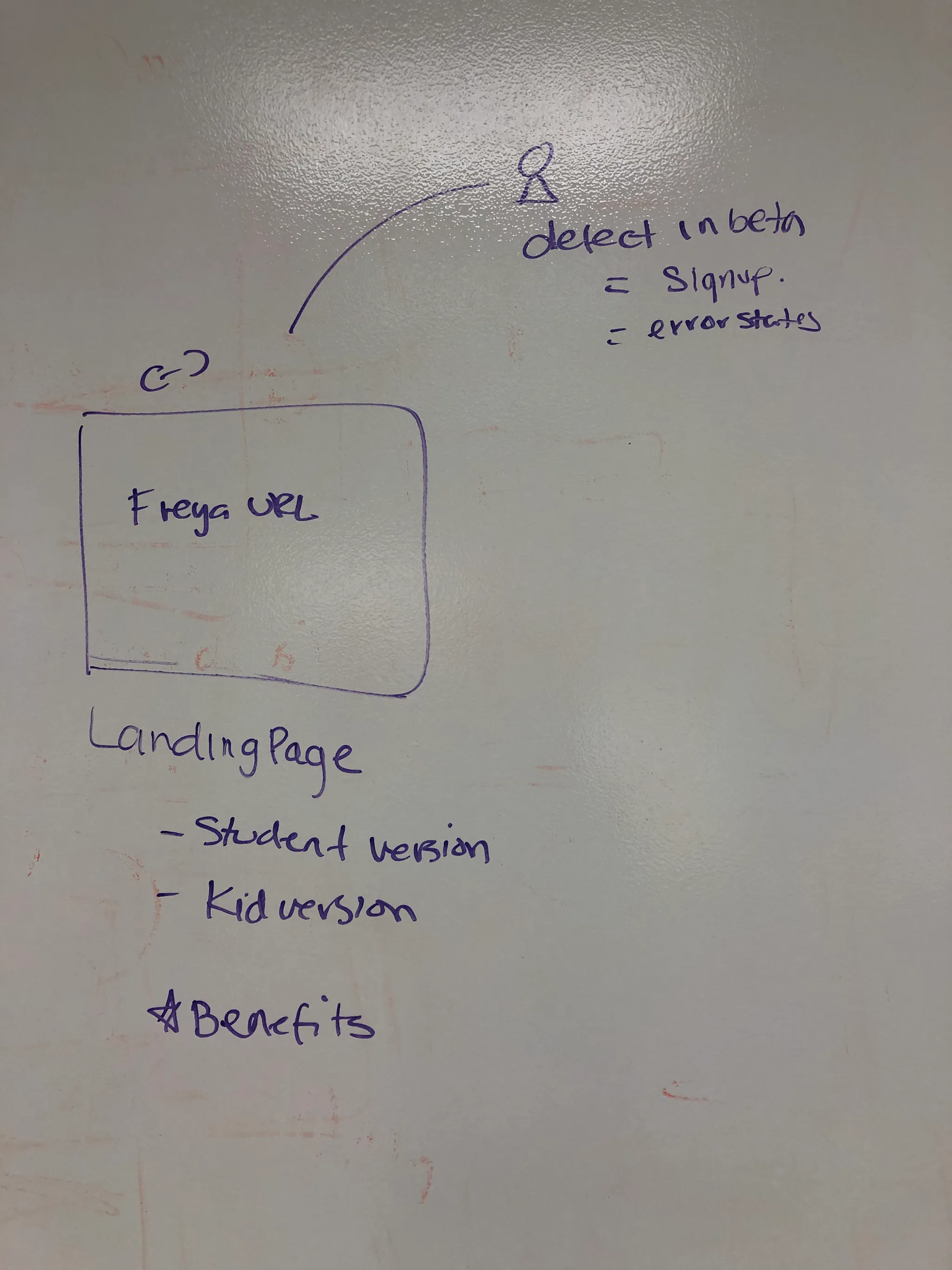
I quickly doodled the user flows and made sure the concept was working systematically* by gathering feedback from stakeholders.**
A conflict arises…
While leadership was happy with the app's progress, after speaking with the board they wanted to release the app earlier by 3 months to make an impact for the upcoming school quarter and give more time for teachers to familiarize themselves with the app before the school year began. PM, Engineering, and I reviewed the features but we decided it was too risky to cut from the MVP to make up for time. We compromised by changing the launch from public to a beta instead with trusted education ambassadors. This reduced the risk as we would continue to have time to test and iterate based on user feedback.
Design Systems
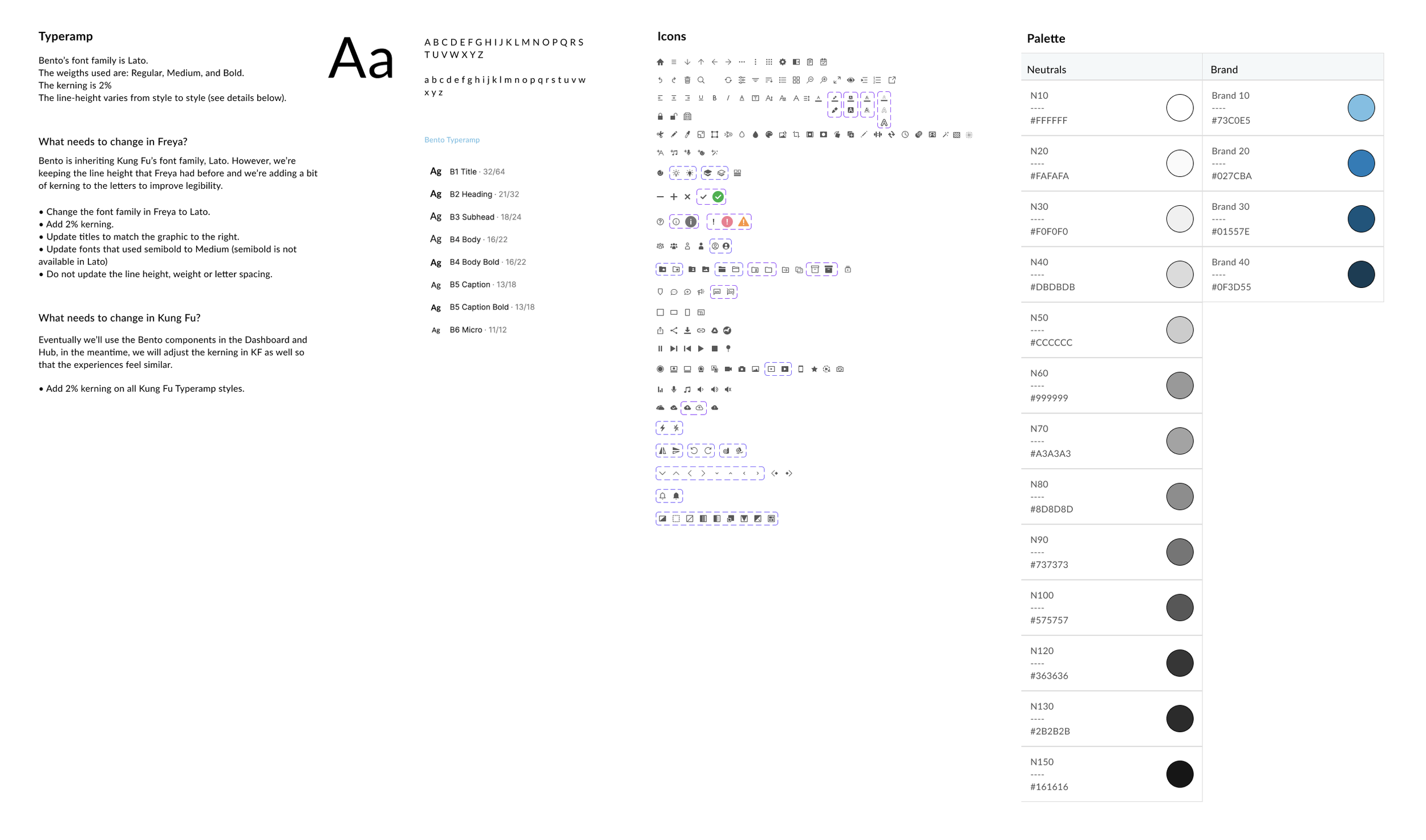
So that Design and development work would be created and replicated quickly as well as create visual consistency, I knew I needed to create WeVideo’s first design system. I took inspiration from Google Material Design as they were an official partner of WeVideo as well as Carbon’s design philosophy as it fit the loosely defined values of WeVideo: friendly and approachable. I made sure that each pattern and standard passed WCAG standards.
Another conflict arises
Despite my best intentions and estimates for development, the engineering team ran into some issues with implementation as some solutions were more complex than previously thought which would put us at risk for missing the official launch date. As a compromise, the PM and I decided to remove some of the flows from the MVP and deliver them as “fast-follows.” We also worked with the marketing team to develop a communication plan with our users on the upcoming releases/ updates to assuage any concerns of lacking functionality and bring awareness (and spark excitement?)
TESTING
Usability Testing
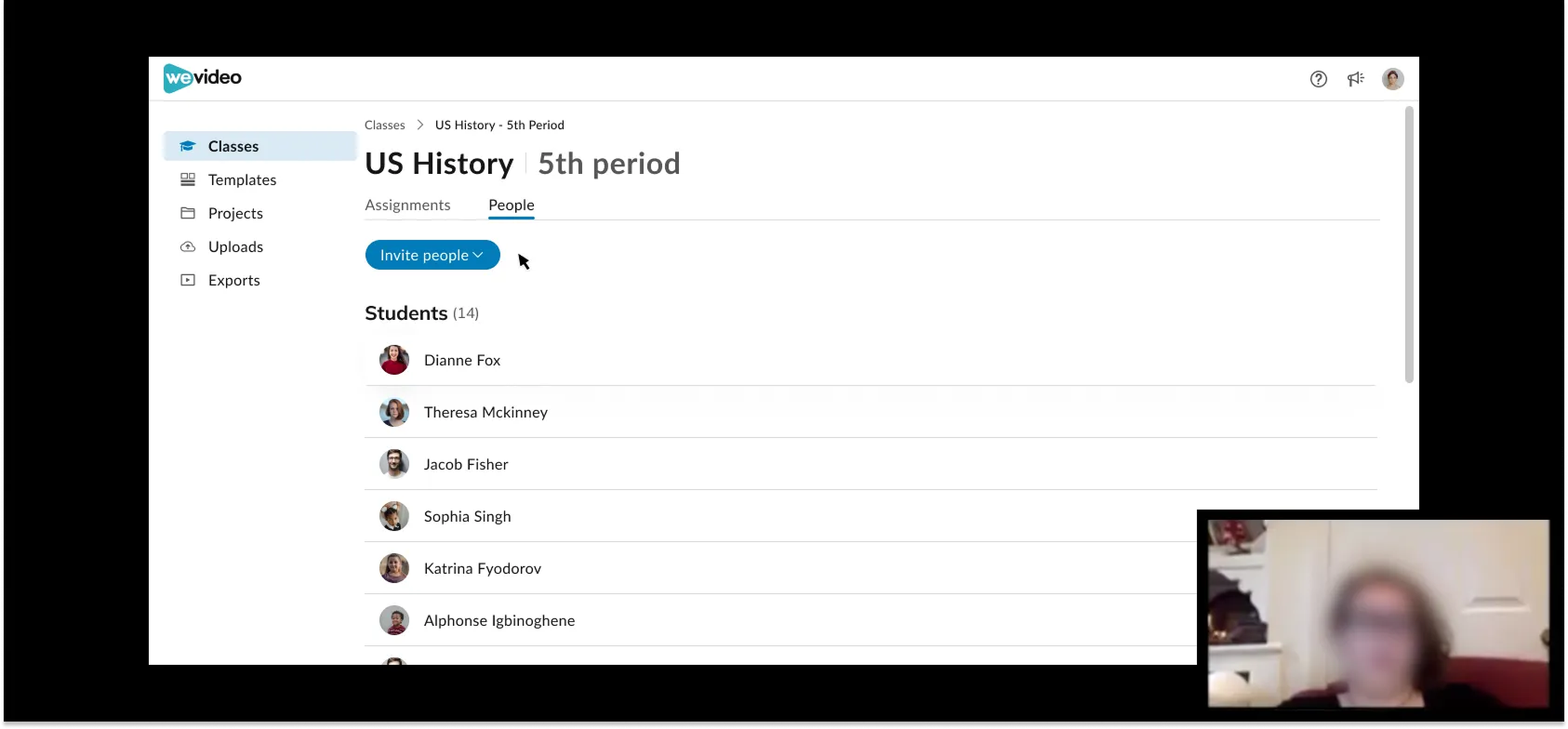
We discovered the need for
More conversational design to guide users through actions on the page for the first run experience
More controls for how teachers can add students
Enhanced editing control for users
DELIVERY
Outcome
After 6 months, we released WeVideo Classroom as a Beta to 55 educators with a successful reception. C-suite leadership commended WeVideo Classroom as an 'exemplary project' that set a precedent for future projects at the company.
A new code base that supported the latest technological advantages and features
Brand new design system
Certified accessibility (as reviewed by Accessibility Solutions Provider “Accessible 360”)
NPS of +33
from the beta program in July 2019
Quotes
Users
“Hi! I used WeVideo Beta this morning with kids and it was SO much easier to use than the former version. Just starting to create, but the class view on the teacher side works great. When I have a finished project, I’ll be sure to share it. Just wanted to thank you for the opportunity to try the beta - it is great for my third graders.”
Danielle Batchelder (3rd grade teacher)
“I’ve been using WeVideo for 7 years so I was skeptical about the Beta, but it really is better!
- Gerald Miller (Tech coach)
“I LOVE LOVE LOVE the new WeVideo Beta. It is so much cleaner and easier to use than the other version. I can’t wait to see where you guys take it. 😍”
- Augustina Lopez (4th grade teacher)
C-suite & stakeholders
“This is effing awesome”
Krishna Menon (CEO)
“Yo dawg I <3 this”
-Oleg T. (CPO)
“This everything I’ve been asking for for YEARS”
Greg J. (Sales)
Learnings
In hindsight, we should have limited ourselves to Google material design for the beta MVP launch and created the design system afterward.
Prioritize quality over quantity: Eliminate flows if you know you can’t do them well/ serve your users
Lean is better than none at all
Sharing designs early and often with PM for awareness and with Eng for feasibility check. Because Eng was in Romania and timing was challenging, I recorded short demos with specific questions in mind. with stakeholders. I also shared the designs with customer service, asking them if they believed this would alleviate some of the users' confusion.
I conducted multi-methodology research efforts to understand the user's core goals better and needs with specific research questions that we needed to get answered. After organizing meaningful findings in a spreadsheet based on features, I consolidated the analysis with recommendations, UX values, and UX priority ratings.
Methods
Interviewing our Education ambassadors - to understand their unique pain points and wants to define use cases and user journeys
Speaking with our sales reps - to know their biggest selling points and detractors in the education space
Competitive analysis - to see how our competitors solved similar issues in Edtech industry
DEFINE [Problem-solving space]
Multi-Persona User Flows
Outcome
After 6 months, we released WeVideo Classroom as a Beta to 55 educators with a successful reception. C-suite leadership commended WeVideo Classroom as an 'exemplary project' that set a precedent for future projects at the company.
A new code base that supported the latest technological advantages and features
Brand new design system
Certified accessibility (as reviewed by Accessibility Solutions Provider “Accessible 360”)
NPS of +33
(from the beta program in July 2019)