
Empowering the Next Generation of Storytellers:
Video Editing for Students
Industry: SaaS, EdTech, B2B, Enterprise
Platform: Responsive Web
Role: Product Designer, User Researcher
Team: 1 PM, 4 Engineers
Timeline: 4 months
Highlight
I was the lead designer in transforming a legacy video editing tool into a seamless, user-friendly experience tailored for kids, enhancing both usability and engagement.
Impact
Increased SUS score by 37%
Background
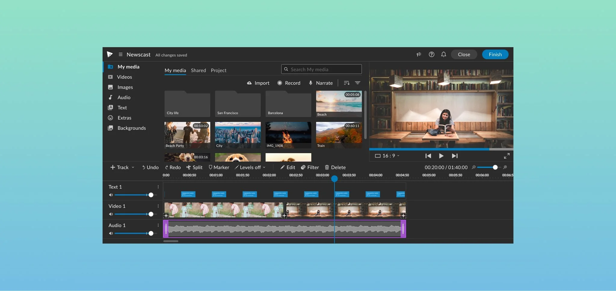
WeVideo, a cloud-based video editing tool, was originally created for the classroom setting 10 years ago. After expanding the product to attract more professionals and enterprise clients, the product had accumulated layers of complex features over the years, many of which weren’t relevant or intuitive for kids. With cluttered menus, unfamiliar terminology, and too many steps, young learners often felt stuck, overwhelmed, or required constant help from their teachers.
Problems
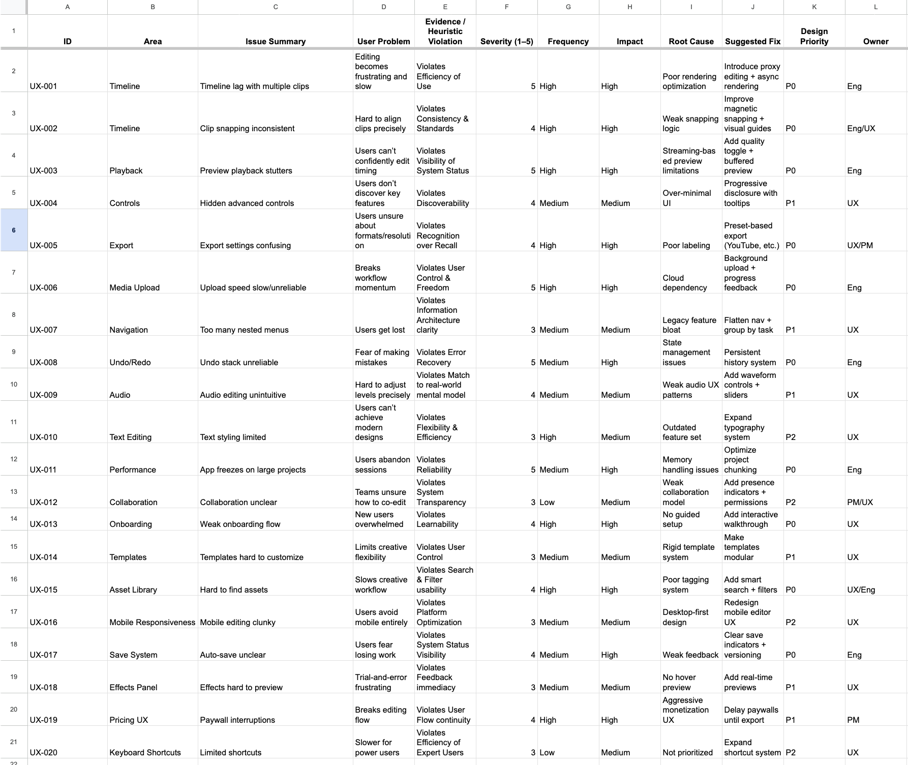
Cluttered and Confusing Interface/ Intimidating
The layout displayed too many tools at once, with little visual hierarchy, making it difficult for students to know where to begin.
Professional Jargon, Minimal Guidance
The editor used advanced terminology like “track locking” and “keyframes” without offering intuitive icons or hints
Opportunity
Students need a simplified, intuitive video editing experience tailored to their skill level and classroom needs. By tailoring WeVideo to provide age-appropriate language and a focused toolset, we sought to transform video creation from a daunting task into an engaging, empowering, and fun learning experience.
Business Goals
Enhance Brand Perception
Shift perception from a complex, pro-level tool to a versatile, education-friendly platform that supports learning through creativity.
Reduce Support Costs
Minimize student and teacher reliance on customer support or IT help by improving usability and guardrails/ guidance.
Improve User Retention
Reduce friction in the student experience to encourage continued use and engagement over time.
Usability Testing
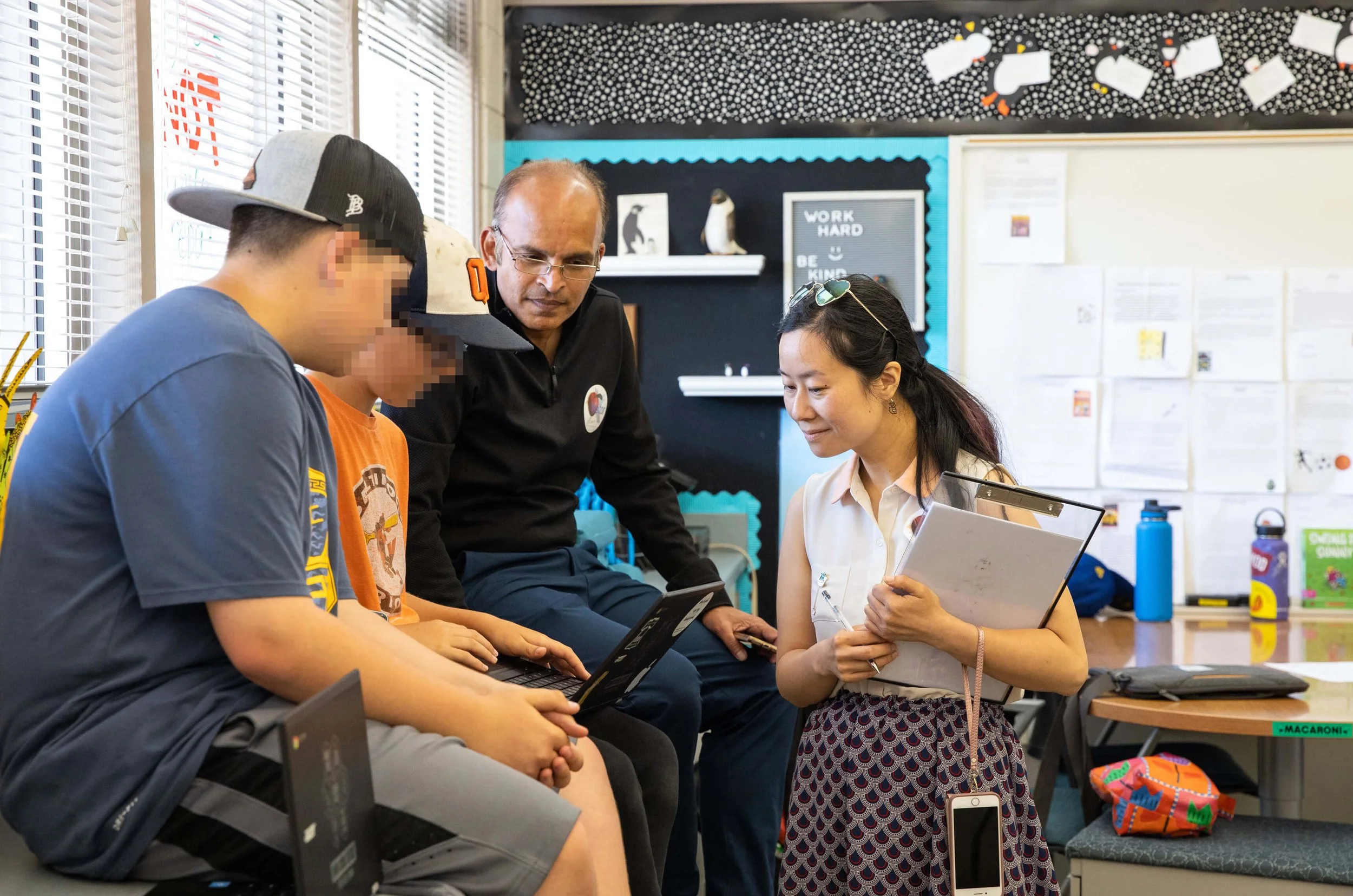
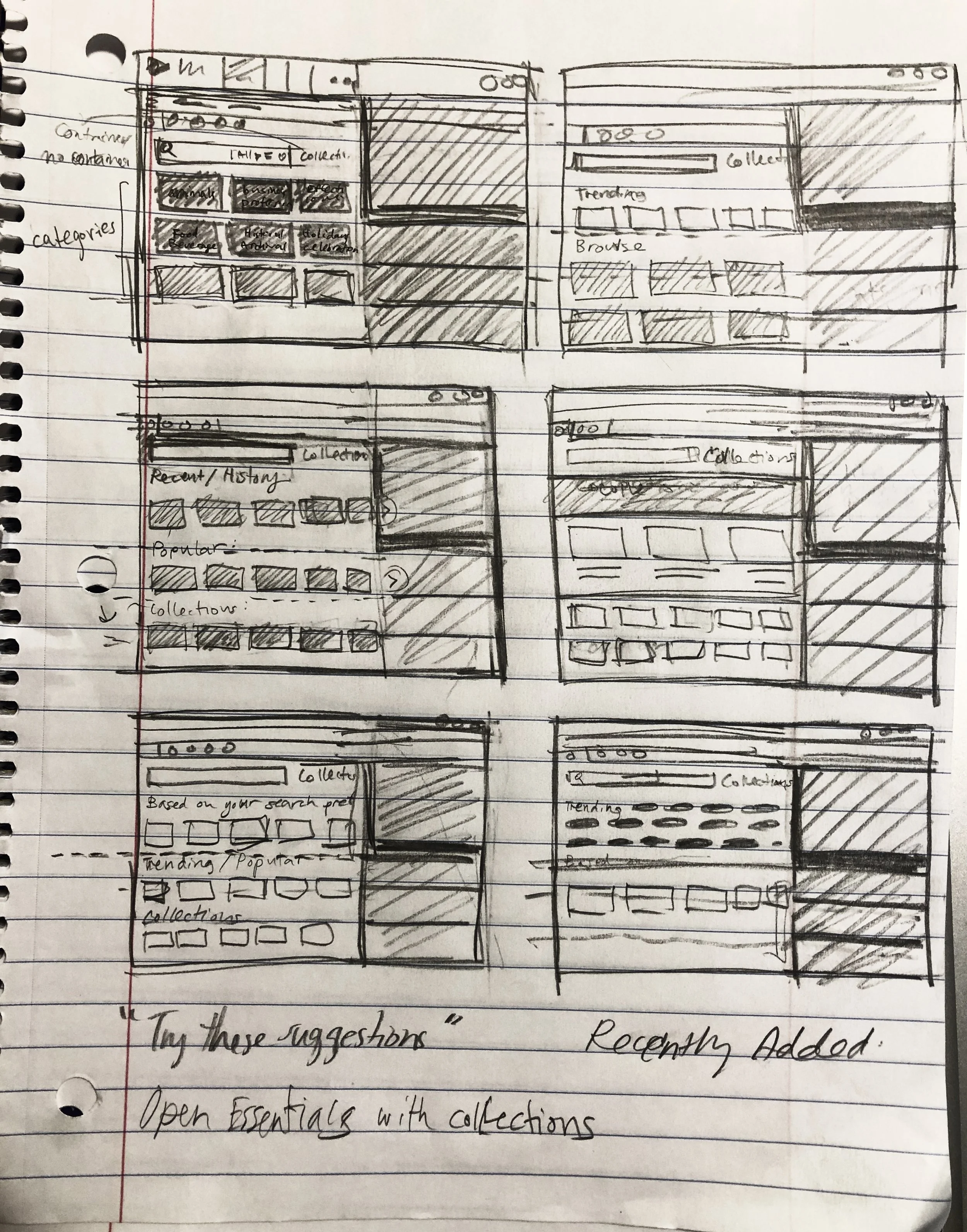
I identified key friction points early, rapidly prototyped a solution, and tested with our Education Ambassadors.
Final Design
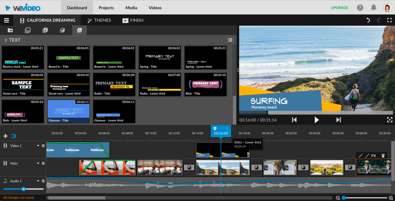
Before
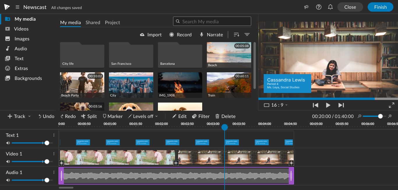
After
Impact
Increased SUS score by 37%
User Quotes
“The new editor removed so many small frustrations. My students stay in flow instead of getting stuck asking for help.” - R. Radner, 3rd-grade teacher
“To be honest, I wasn’t sure about the changes at first, but it really is better and easier to use!” – S. Weber, Tech Coach
“The interface feels so much cleaner now.”– H. Hernandez, Tech Coach
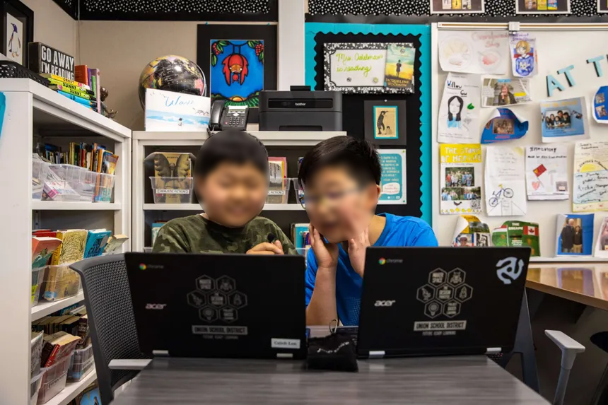
Main takeaways
Users skipped key steps we thought were intuitive, highlighting where clearer guidance or design cues were needed.
While users said the feature was useful, testing showed they struggled to find or use it. This highlighted the need for better discoverability.
After design updates with clearer next-step navigation, there was a 30% increase in task success rate.